Stacja Architekci
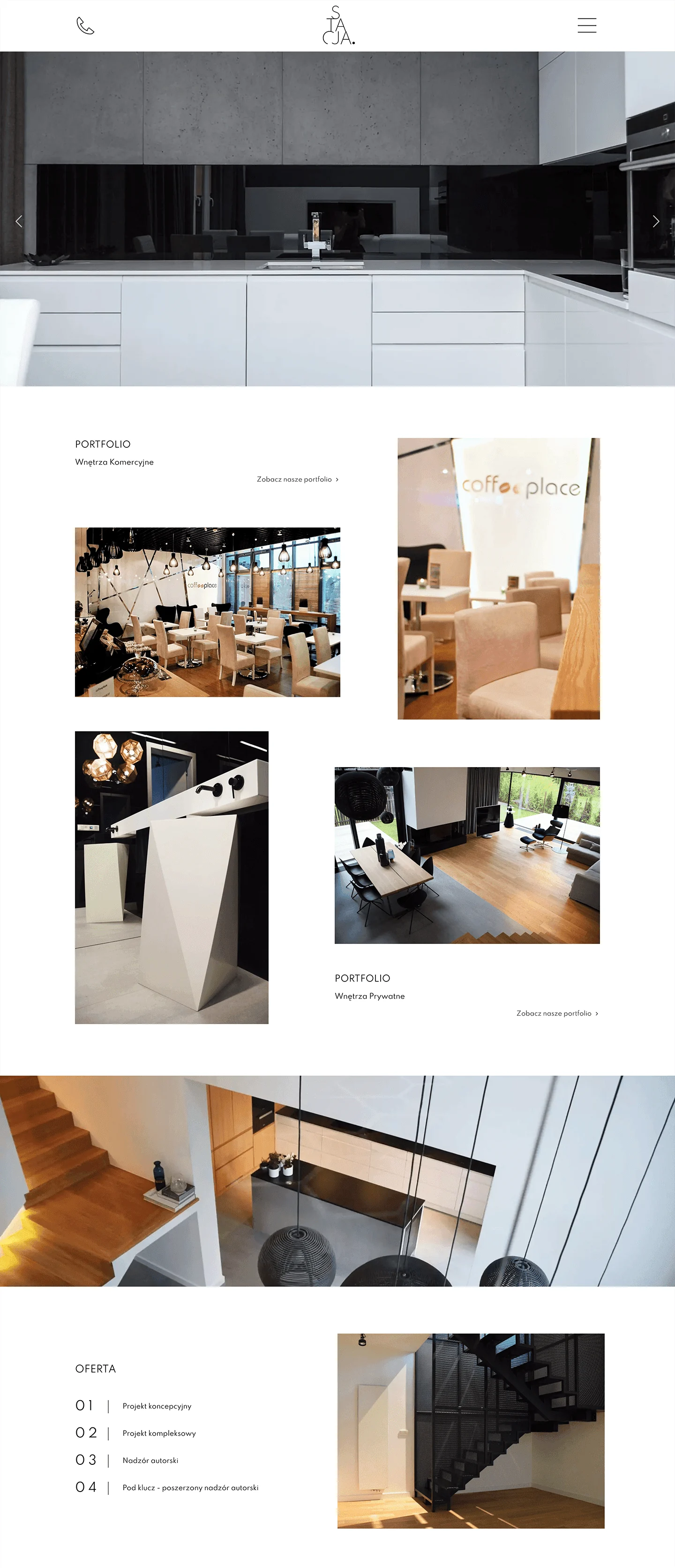
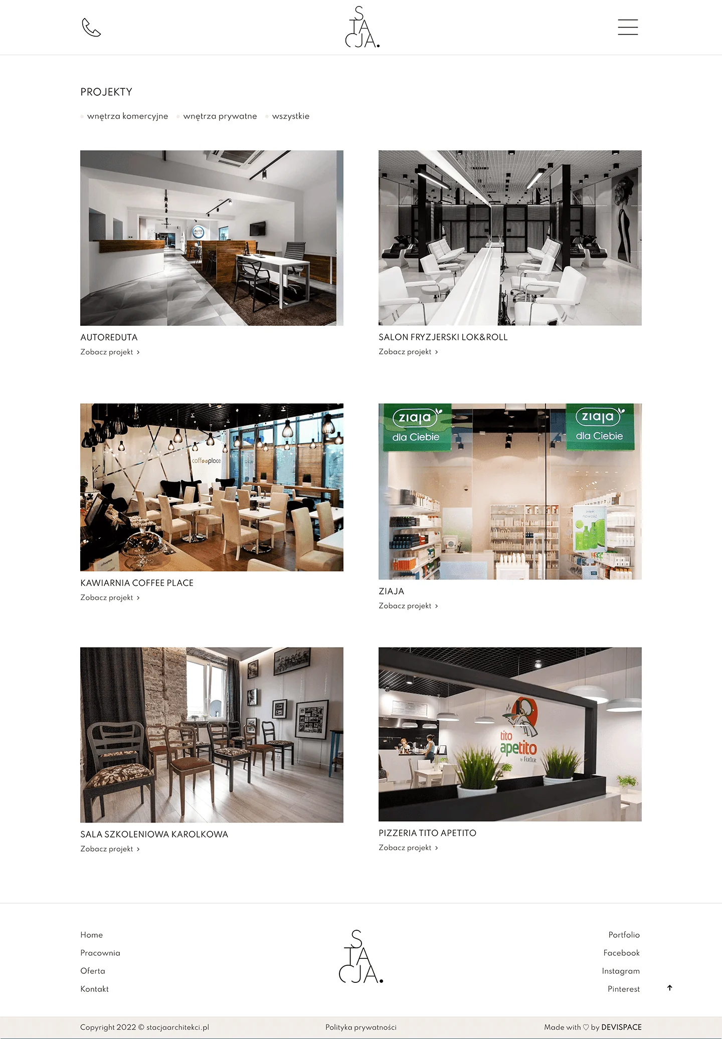
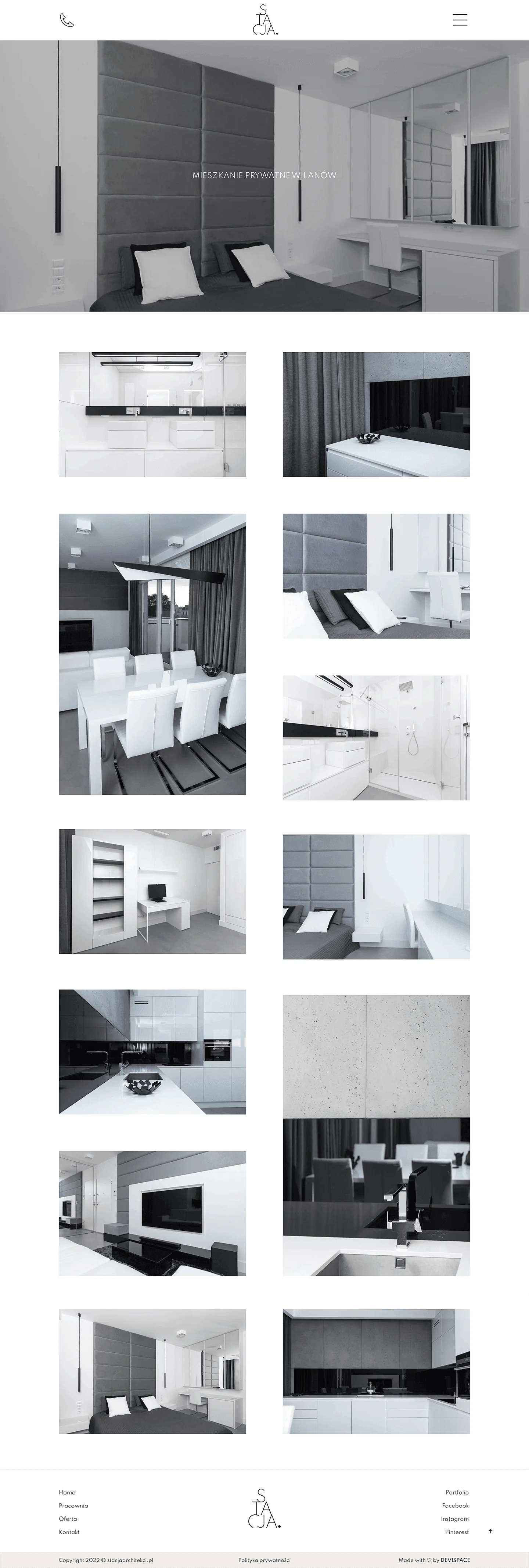
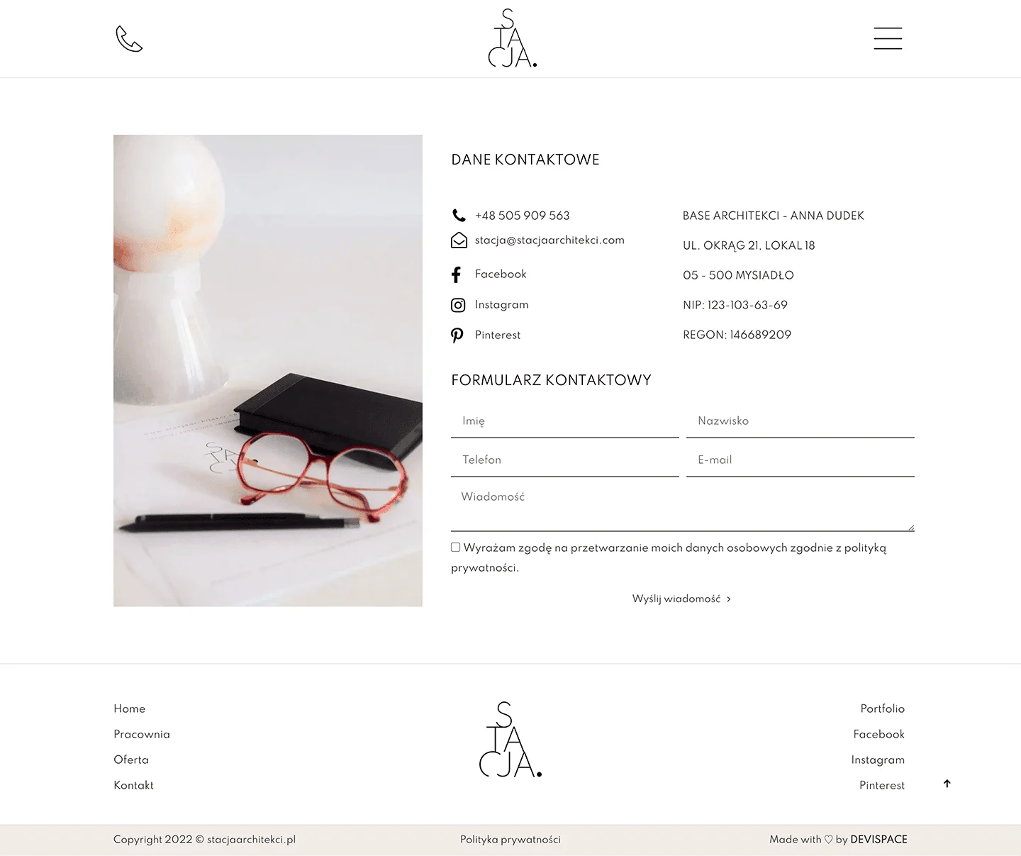
A design studio's website had to be highly graphic - and we delivered that. On the homepage we focused on photos of the studio's projects, which speak for themselves. Copy is kept to a minimum. If clients want to know more, they use the menu at the top, where the offer is described in detail. The whole site stays in calm grey and white.
Each screenshot is a full subpage - scroll inside the frame to see the rest.